Font-Forward Watch Designs: A Roundup
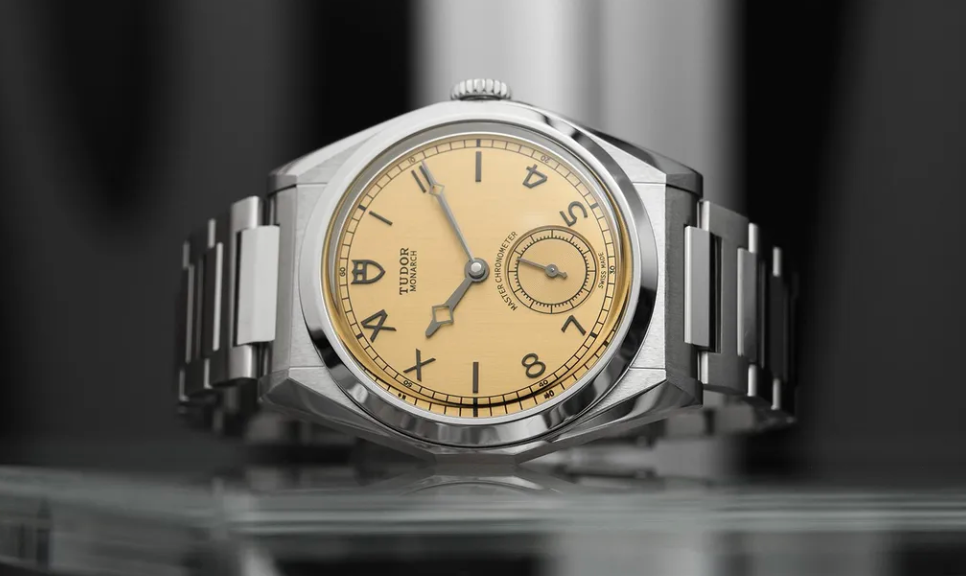
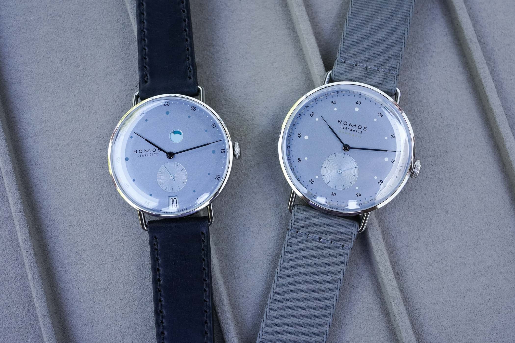
The piece explores how contemporary watch brands are using innovative typography on dials to reinforce brand identity, improve readability, and reflect evolving artistic directions in luxury watchmaking. It highlights examples such as Hermès’s Slim d’Hermès, which features a custom sans‑serif typeface created by Philippe Apeloig, and Chanel’s Monsieur, where Arnaud Chastaingt designed a bold, structured numerals set to convey masculine elegance. The article also examines NOMOS Glashütte’s Bauhaus‑inspired fonts, Tudor’s Monarch with its blend of Arabic and Roman numerals, and Franck Muller’s Vanguard Damascus, which sculpted its numerals from Damascus steel for both aesthetic impact and legibility. These case studies demonstrate a broader shift from traditional, widely used fonts toward bespoke typefaces that serve as visual signatures for each brand. By tailoring lettering to the watch’s design language—whether through subtle line variations, historic references, or avant‑garde sculptural elements—manufacturers enhance the storytelling power of their timepieces and create a distinctive visual experience that goes beyond mere function.
Buying Time Analysis: This story highlights how innovative typography in watch dials shapes brand identity, enhances readability, and reflects the evolving artistic direction of luxury watchmaking.