Does Tudor Have a Design Tease Issue?
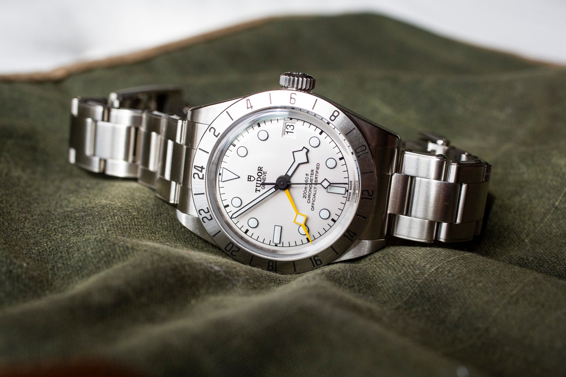
Tudor’s recent collections often showcase strong, well‑executed designs that are subtly undermined by singular choices, such as overly thick cases, unconventional dial colors, or atypical lume tints. The Black Bay Pro, while a faithful homage to vintage models, feels incomplete due to its excessive bulk, and the new 39 mm Black Bay Chrono’s bright yellow dial, though playful, sacrifices broader wearability in favor of a bold aesthetic. Similarly, the Ranger’s green‑tinged lume, rather than enhancing the watch, draws criticism for deviating from the more classic lighting preferred by enthusiasts. These recurring details suggest a pattern where Tudor delivers near‑perfect watches but introduces a final element that prevents them from reaching unequivocal excellence. Whether this is an intentional strategy to keep the brand distinct from Rolex, a reflection of a distinctive house style, or simply an oversight remains debated, yet the consistency of these design teases continues to shape perceptions of Tudor’s recent releases.
Buying Time Analysis: The article reveals how Tudor’s recurring design compromises subtly shape its brand identity and market positioning, offering insight into the strategic balance between innovation and differentiation.